By José Gandue @Gandour
I'm clear about this: I'm not a designer. I can't draw (every time I try, I end up with unremarkable scribbles, and my circles look more like American footballs than anything else), and I've barely learned to use the basic tools in Photoshop. I've always been drawn to typography, but as an amateur, someone who enjoys looking at catalogs of fonts from all eras. And yes, I love seeing the posters for the world's biggest music events. Some of them seem like masterpieces to me. That's why, for all these years, I've taken the liberty, publicly or privately, of expressing my opinion on the promotional artwork of my favorite festival: Rock al Parque.
In general, the work done in this area by the continent's largest free festival hasn't convinced me throughout its history. They've held public competitions, hired external designers, and even done it in-house, by the internal teams of all the institutions that have organized the event, and frankly, I haven't seen anything that impresses me, that makes me think about how attractive and important the festival is. Since 1995, I've observed the overuse of guitar references alongside greenery, hand-drawn horns to attract or repel (depending on the context) supposed rock 'n' roll devils, or, in some very out-of-place instances, snails with metal (and metalhead) studs and mythological animals in leather jackets that I've never encountered at Simón Bolívar Park. There was one that seemed more like something designed to promote a play. Waiting for Godot One poster was for a music concert, and the other was closer to the aesthetic of a Nazi comic than to the most massive, open-minded party on the planet. You might say, "This guy's such a pain," but I think of concert posters as collector's items, unforgettable memorabilia, graphic icons that reflect an era.
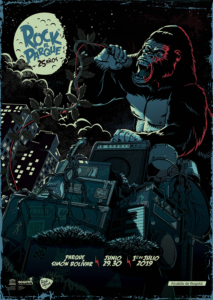
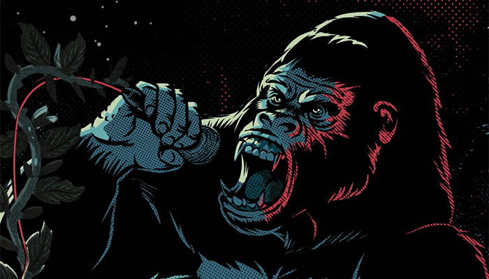
I look at the new promotional piece for Rock al Parque 2019. I see a gorilla on top of speakers and instruments, yelling into a microphone. The piece is eye-catching, very well drawn. The colors work. But (yes, the but had to come), what does this have to do with the twenty-fifth anniversary celebration of Rock al Parque? I expect a promotional piece for a festival as important as Rock al Parque to, in a single visual impact, excite me, inform me, and make me want to go to the event. And even more so if, as will happen when the posters are distributed throughout the city and copies are published in various media outlets, this image will be seen by many people who don't even know the festival exists. Yes, because despite making waves since 1995, Rock al Parque, being an institution that every resident of this city should be proud of as a clear example of coexistence, peace, and culture for all, is unknown to most of our neighbors in the Colombian capital.
I insist: Graphically, the piece is striking. But let's do an exercise: If you were shown this poster and told it was for a rock event in Tallahassee or Bangkok, you wouldn't notice the difference. The poster is great, the person responsible for this piece is a true professional, but this image doesn't speak to me about Rock al Parque, it tells me nothing about it. The best graphic pieces I've seen for festivals around the world are impactful, but at the same time, they don't require an explanation from the designer to justify the result. And, above all, when I see those works that move me, I immediately feel that they were created from the very spirit of the event they represent, and unfortunately, in this case, I don't perceive it that way. I find it curious that the promotional images for the other Rock al Parque festivals (Jazz, Salsa, Colombia, and Hip Hop) connect immediately, especially those created in recent years by the same team that brought the gorilla idea to life. I haven't understood what's going on here.
I understand that the poster, thankfully, doesn't change the decision of Bogotá's rock fans to fill Simón Bolívar Park on June 29th and 30th and July 1st. But, as a fan of good design and the importance of effective communication, I feel that, despite the effort, the opportunity to better convey what Rock al Parque means has been lost all this time. I regret it.