
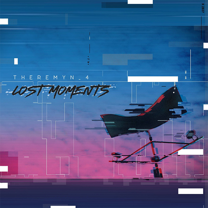
By the Zonagirante.com team @spinning zone
Thinking that, despite 2020, there is a future for music (come on, pessimistic friends!, take a break, okay?), We know that all the albums and singles that will be released next year will still need an attractive cover. Their sounds need to be visualized in order to distribute them through digital platforms, and, For those who have the budget to publish their physical prints, in any format. It's the image that artists might circulate among their fans when creating promotional material and their own merchandising. That, too, is money that will be welcome in the struggling coffers of musicians, should they go out and sell their t-shirts, caps and other items that are part of their specialized paraphernalia.
On the other hand, let's be clear: Most album covers released in Latin America (and anywhere in the world) are poor, if not downright horrifying and inappropriate. Some are disgusting, others are barely unpleasant, and many are simply forgettable; we see them and they quickly fade from memory. After all, not all of them can include the banana that Andy Warhol painted for the Velvet Underground., showcasing the most famous quartet in history walking single file across the zebra crossing on their way to their recording studio, or throwing a baby into a pool to simulate swimming after a dollar bill. Fortunately, there are also a good number of interesting works that manage to convince us that behind that great graphic design lies a good collection of songs that deserve to be heard immediately. Accompanying a record release with a bad cover drastically reduces the chances of getting attention from potential listeners., And anyone who still insists that the image is merely a trivial resource to promote the songs, suffers from blindness or, worse, chronic stupidity.
For all these reasons, we approached six renowned designers, residents of New York, Quito, Lima, Bogotá, Mendoza and Tijuana, with experience in the recording industry, to answer questions about their work, their relationships with artists, and the best examples they consider to be in contemporary Latin American music that have earned them the title of the greatest in history. These were the questions:
1. What needs to happen to a record cover for it to be successful?
2. What should your musician client understand about your work as a designer?
3. What are the most common mistakes when designing a cover?
4. In the musical history of Latin America, what might be your favorite album cover?
————
Giselle Manzano Ramirez (New York)
Portfolio: https://gisellelowpoly.com/
1. A picture is worth a thousand words. The success of an album cover lies in its ability to effectively communicate the album's content. All visual elements, from color and imagery to composition and typography, must be carefully considered to visually represent the album's concept and content. Album cover design should be eye-catching and distinctive, as it's the image that will represent the artist and their musical journey through this album.
2. The musician client must understand that album covers are branding. A musician must understand who they are, who their audience is, what they want their listeners to feel when they hear them, and what their influences are. These are essential questions for understanding and subsequently representing an artist visually.
3. Unfortunately, the digital revolution has reduced sales and physical production of compact discs. As designers, we must remember that the vast majority of album covers are now viewed online, so the design must be visually relevant. on-line as offline.
4. My favorite cover is The Great Escape, by Willie Colón. It was designed by Izzy Sanabria in 1971 for Fania. I'm a huge salsa lover, as I was born in Cali, Colombia. Salsa is a cultural heritage of Cali, a gift from Mother Africa and Cuba, Puerto Rico, and New York. Now, at 28 years old, I've been living here in New York for six years, the city where this musical genre emerged and spread throughout the hemisphere. This album and cover perfectly represent how I feel as a Latina immigrant in New York.
Fritz Torres Carrillo (Tijuana)
Portfolio: https://www.instagram.com/tijuanacovers/
1. On the one hand, it must capture the visual attention of a viewer who is already predisposed by an auditory stimulus. On the other hand, regardless of whether you know the band or not, the album cover establishes the frame of reference from which we begin to judge the artist, even before having heard them. Therefore, the connection between the design and the music must flow naturally and sincerely to achieve that perfect pairing that makes them inseparable.
2. For me, nothing in particular. Sometimes you're guided by the music to create the concept, or by some vision the artist might have for their project. Every detail contributes to the decision of taking a certain creative path. However, there are also times when you're dealing with the record label, and that's valid too. They manage the budget and pressure you to do things according to their market vision.
3. For me, there are no mistakes, everything is transformed. Although I would generally recommend paying attention to typography; there are magnificent illustrations or photographic images that, as album covers, are relegated to a second-rate level due to poor typographic choices. The only real mistake, I think, would be trying to please the record label.
4. Ugh, that's a tough one. – I don't think I have a favorite, but I could mention a few:
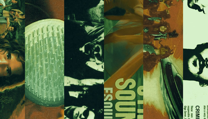
– Other Worlds, Other Sounds by Juan Garcia Esquivel – I like it because the image manages to capture that “space age/sexy/surreal” atmosphere that goes perfectly with the music. The album is in that same vein. Mambo! by Yma Sumac, It's a gem, with a very suggestive and exotic cover, just like its music.
– I like album covers that use illustration, like those designed by Dr. Alderete for Los Fabulosos Cadillacs and Lost Acapulco.
– I really like the covers of Latin Jazz and Bossa Nova albums from the 60s and 70s, the typographic use with basic geometric elements and the exquisite color palette. Although I think those covers are more typical of the international versions.
I find the character of the album covers of mostly unknown punk bands very striking. underground. These are the kinds of cases where the cover automatically makes it clear what kind of music it contains.
Gonzalo Martín Lanzilotta (Mendoza)
Portfolio: https://www.instagram.com/plastiboy.inc/
1. It must visually convey the concept of both the band or musician and the work; what is conveyed through the music is accompanied by the cover and a whole is achieved where the designer/illustrator is the link between the artist and the one who perceives the work.
2. While the artist participates in the concept as it's refined throughout the cover sketching stage, they must completely trust the designer/illustrator. Often, the artist insists on imposing their own idea, which isn't always the best option. This becomes even more complicated when it's a band and more than one person is involved. Ideas should remain just that—ideas—and the final decision should be left to the qualified professional, since that's precisely why someone is hired to handle that part of the artwork.
3. It often happens that during the creative process, motivation wanes or the idea we wanted to express shifts to something we can no longer visualize. In that case, we have to abandon the project or approach it as professionally as possible, producing a final product that fulfills its purpose of illustrating the work. Personally, I believe there are no jobs done reluctantly; every job is an exercise that helps us grow, and the more challenging it becomes, the more we will have learned in the end.
4. The disc War of Nerves from the Argentinian band Los BrujosIt's the perfect synthesis of what I want to see on an album cover. I love the aesthetic of B-movies (gore, 50s sci-fi, slasher, giallo, etc.), and both the band's style and the lyrics lean in that direction. Presenting the musicians as characters and the album as a low-budget sci-fi film visually prepares us for the full musical adventure of this amazing record.
Lucho Correa (Bogotá)
Portfolio: https://www.luchocorrea.com/

1. It's hard to say. Everything has changed so much. Nowadays I'd say it has to work in miniature, in a thumbnail from shopping apps or streaming of music. Many people have no other contact with the cover.
2. You must understand that we are a kind of “translators” of the general concept of the musical project into graphic language.
3. Again, nowadays I believe that not having excellent legibility and a strong synthesis in the image.
4. The original of Women by Silvio Rodriguez I always loved it. Red ink by Calamaro. And locally I think that The land of oblivion by Carlos Vives He's an icon.
Renzo González Vereau (Lime)
Portfolio: https://www.behance.net/gallery/109684043/Caratulas-de-disco
1. It has to make an impact. An album cover definitely needs to grab attention instantly, both in terms of visual competition in a record store and as a piece that deserves to be collected by the artist's fans, all while maintaining coherence with the artist or the content of the production.
2. You must understand the similarity between the work of musical composition and design, but at the same time understand that when developing a cover project, designers apply various graphic exercises interpreting the ideas of the client-musician, telling a story and developing a visual concept that complements the musical production.
3. Failure to communicate effectively. A client-musician may have a clear idea that might work, or it might not result in a good album cover, and they might also come with a specific idea for colors and other details. Dialogue between the two creates a balance between their perspectives, offering critiques and unexpected twists that shape the starting point for the collaborative work. Failing to assert a valid point of view with solid arguments is also a common mistake. Another error is prioritizing one's own taste over the client's request. Other errors include being stingy with resources when designing the cover. One that I almost forgot, and which is also quite common, is agreeing to design a cover without a solid or defined idea of the direction they want to take the album.
4. This is quite a complicated question; there are many good covers, to mention a few: Soda Stereo-Stereo Dream, The Rodriguez-More words, fewer words, The Fabulous Cadillacs –I warned you.
Edgar Castellanos (Ambato/Quito)
Portfolio: https://www.instagram.com/imborde_grafico/
1. In these times, it has to be disruptive, intuitively attracting the viewer's attention. It has to generate an emotion associated with the musical style it encompasses.
2. The designer's job is to visually communicate the musician's concept, enhancing the sensations the music aims to evoke.
3. When the musician does not have a clearly defined concept, it is difficult to generate an ideal workflow and ideas end up piling up.